
I led and executed the rebranding from Salemove to Glia. Since the rebranding, Glia has experienced a tenfold increase in customers and reached a valuation exceeding $1 billion. As of 2025, Glia has partnered with over 600 insurance companies, banks, credit unions, and other financial institutions worldwide to improve the customer experience and drive business results.
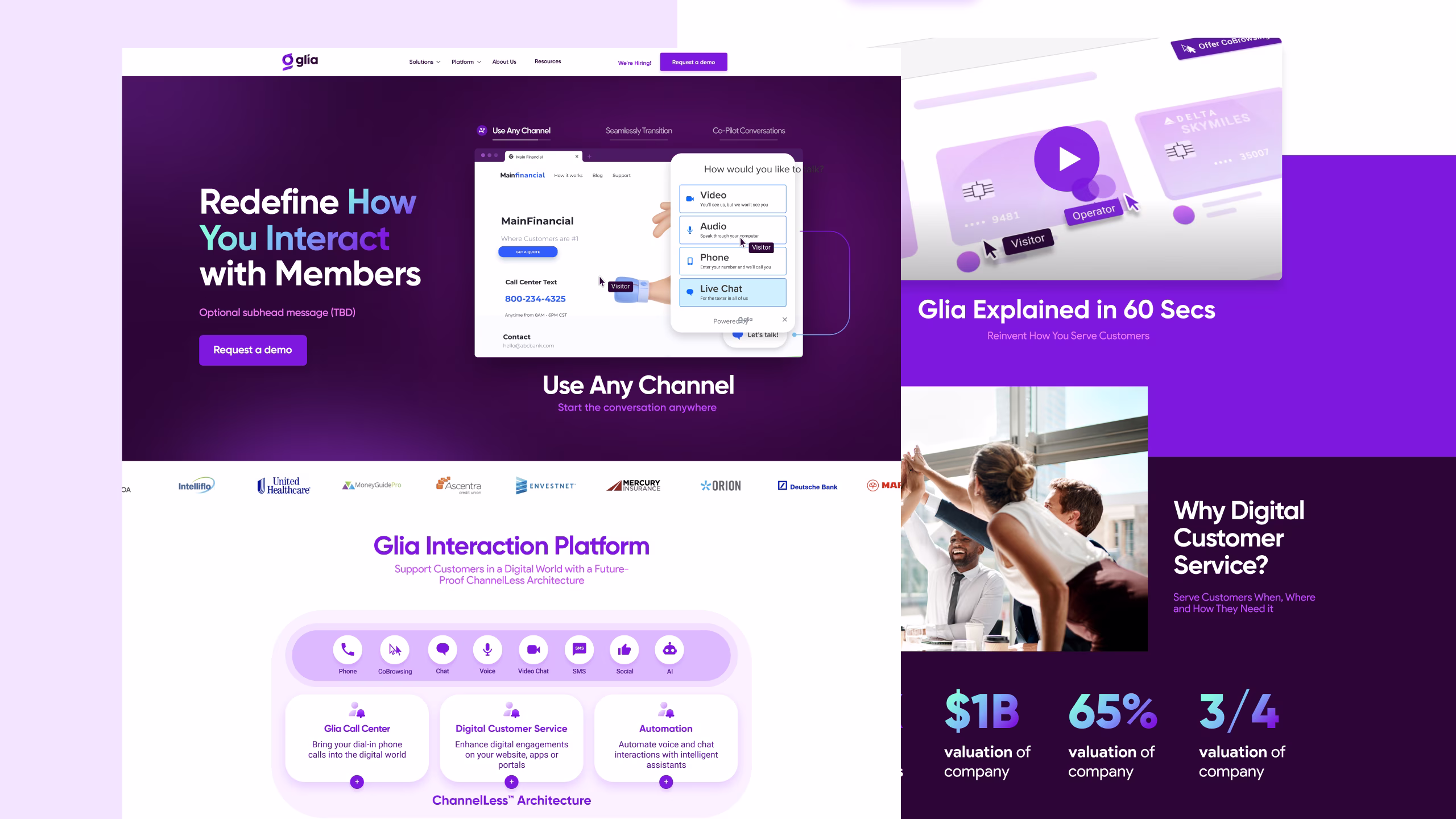
Since the brand's launch in 2019, many direct competitors have adopted design elements, marketing strategy, and brand tone from Glia.
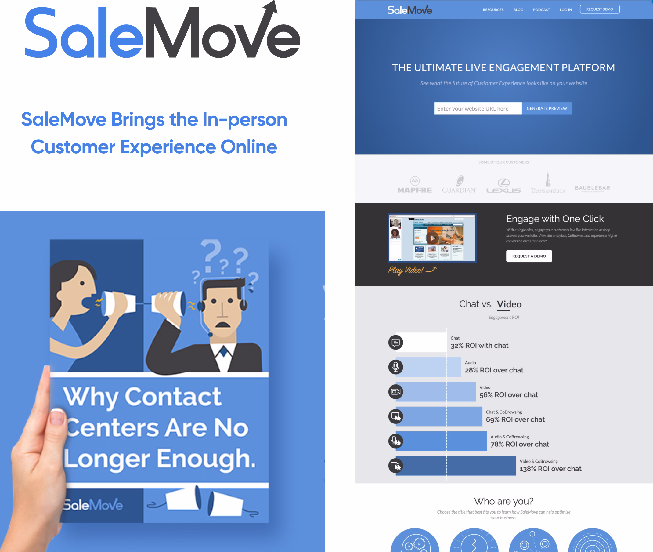
SaleMove’s vision was to meet and exceed the in-person customer experience... online. SaleMove had been in the market for six years since 2012. However, around 2018, it became evident that the name was hindering progress and drove the need to reposition themsselves.
The name SaleMove no longer accurately represented the business, as it suggested that we were primarily focused on a platform that helped businesses move their sales online. The focus had shifted to the financial industry, and the company needed a new identity to reflect the direction.
Glia was the perfect analogy for the platform. The most numerous cell in the brain, the glue that holds communication together. It was melodious, short and meaningful.
In neurosciene Glia is the most abundant cell in the brain, which provides support for all the communication that is happening in the brain.

During the visual design stage, while exploring logo marks, I initially considered three key concept directions:
1. Brain + Tech Integration – Merging technology with human elements to emphasize connectivity, aligning with what Glia represents.
2. Typography-Based Approach – Focusing on the letter "G" as a distinct design element.
3. Platform-Inspired Design – Drawing inspiration from our platform’s core channels, such as audio and video.
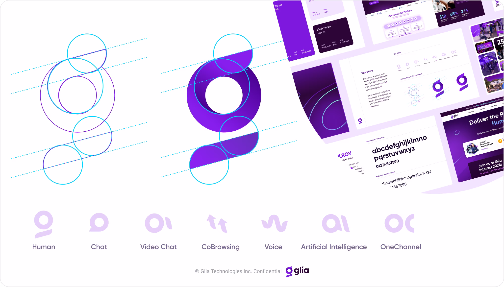
Altogether, over 80 logo marks were created. I was drawn to one that featured a G-like figure, encapsulated our core pillars, and, most importantly, embraced simplicity—something so intuitive that even a child could draw it.
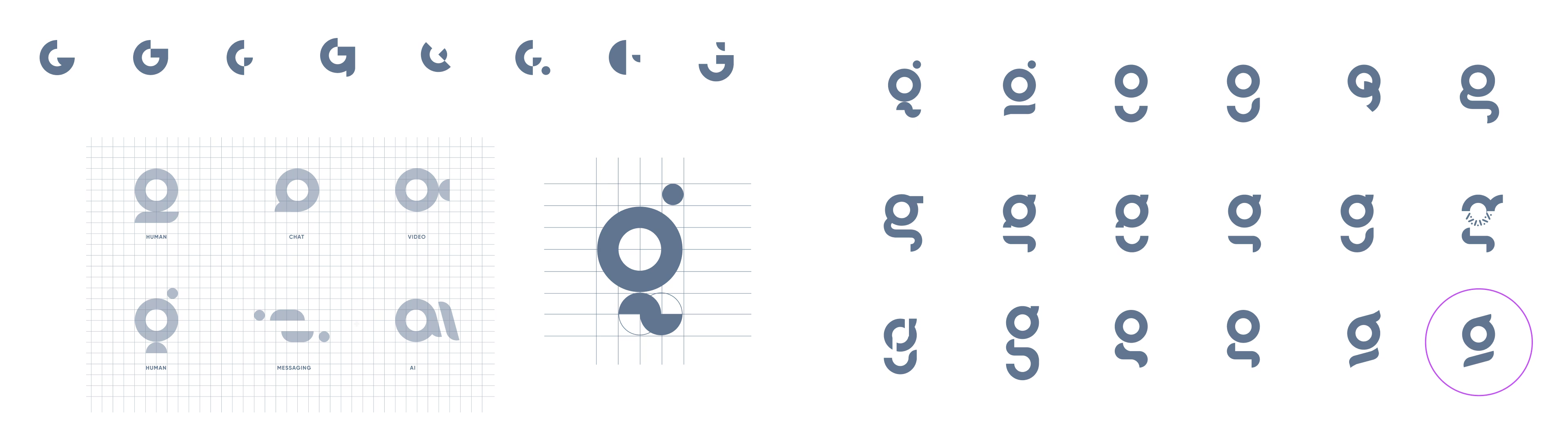
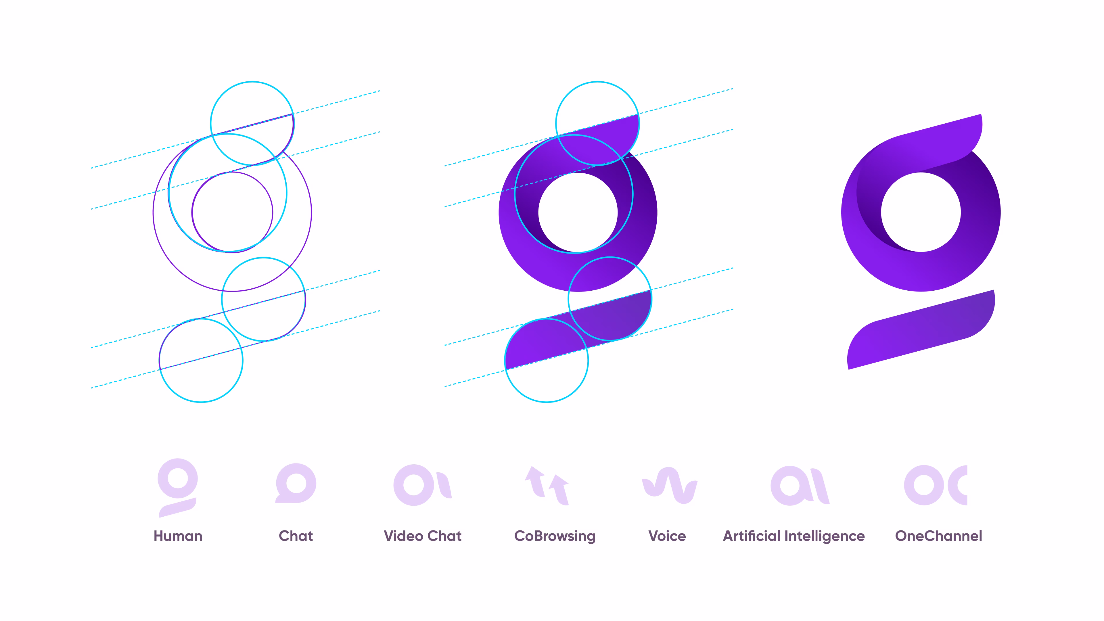
Glia's distinctive logomark merges the letter G with Glia's ChannelLess® concept, fusing all our platform's core pillars (human, AI, audio, video, etc.) into one unified symbol. The logomark represents their unified approach to customer interactions.
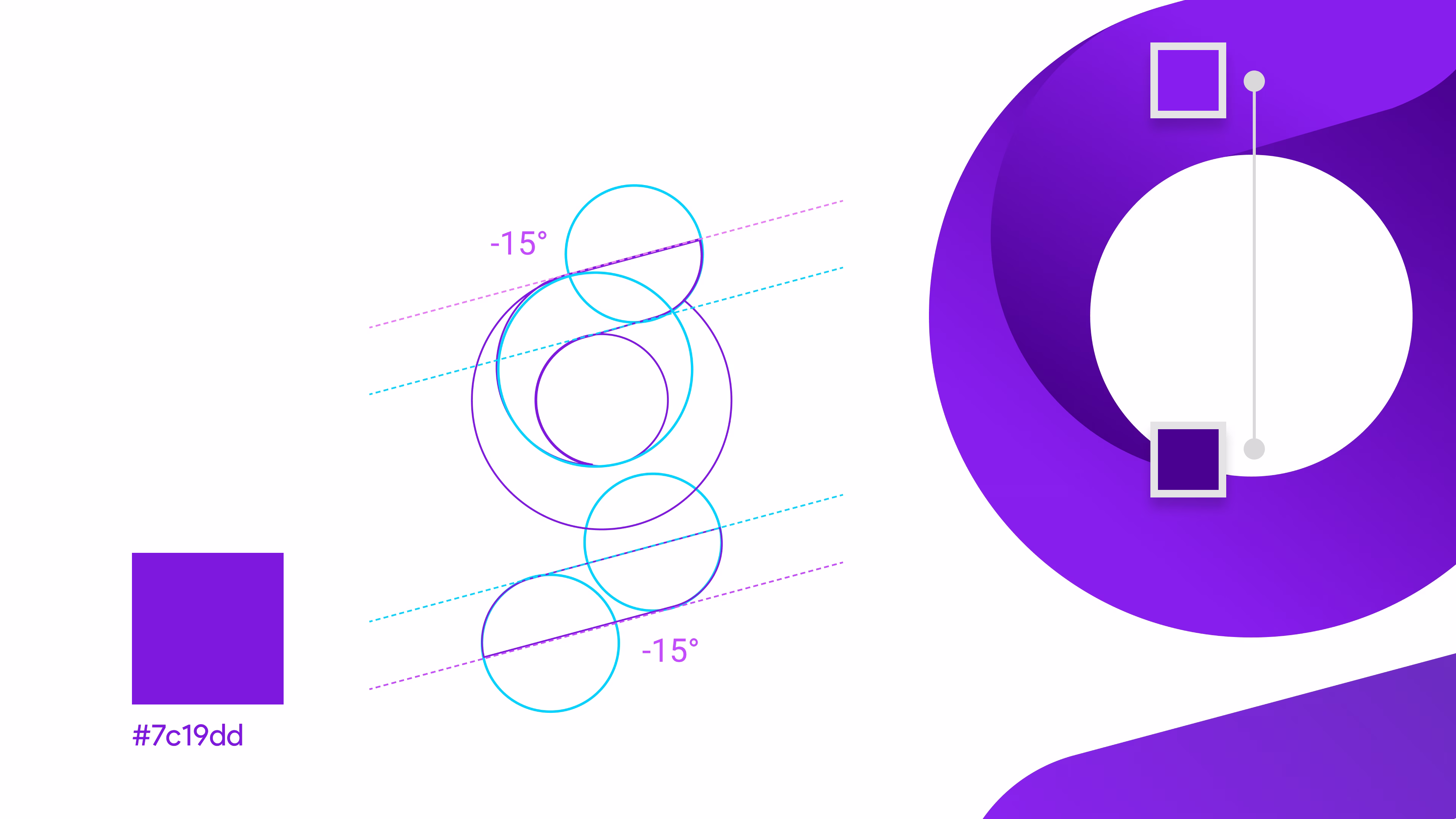
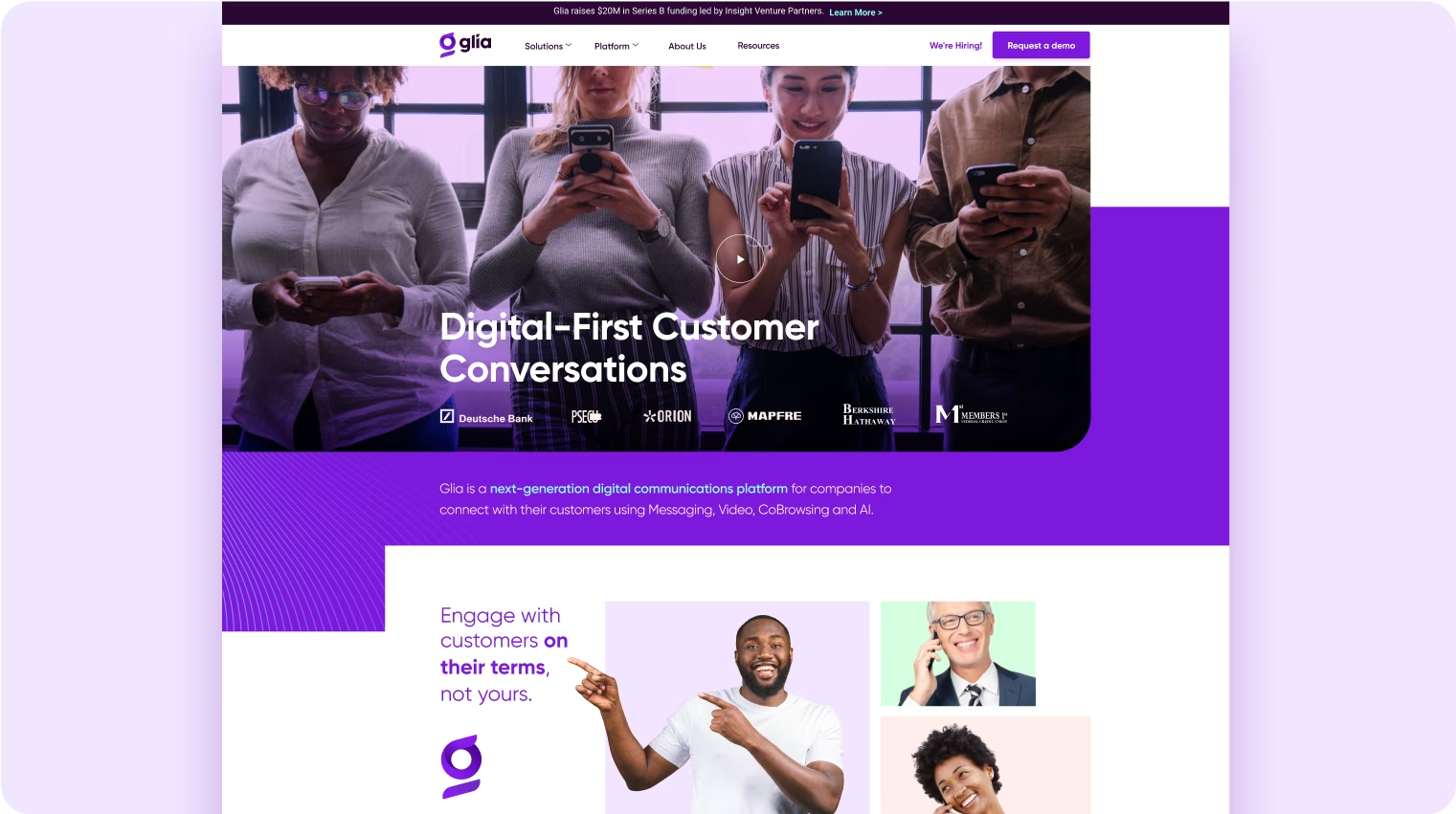
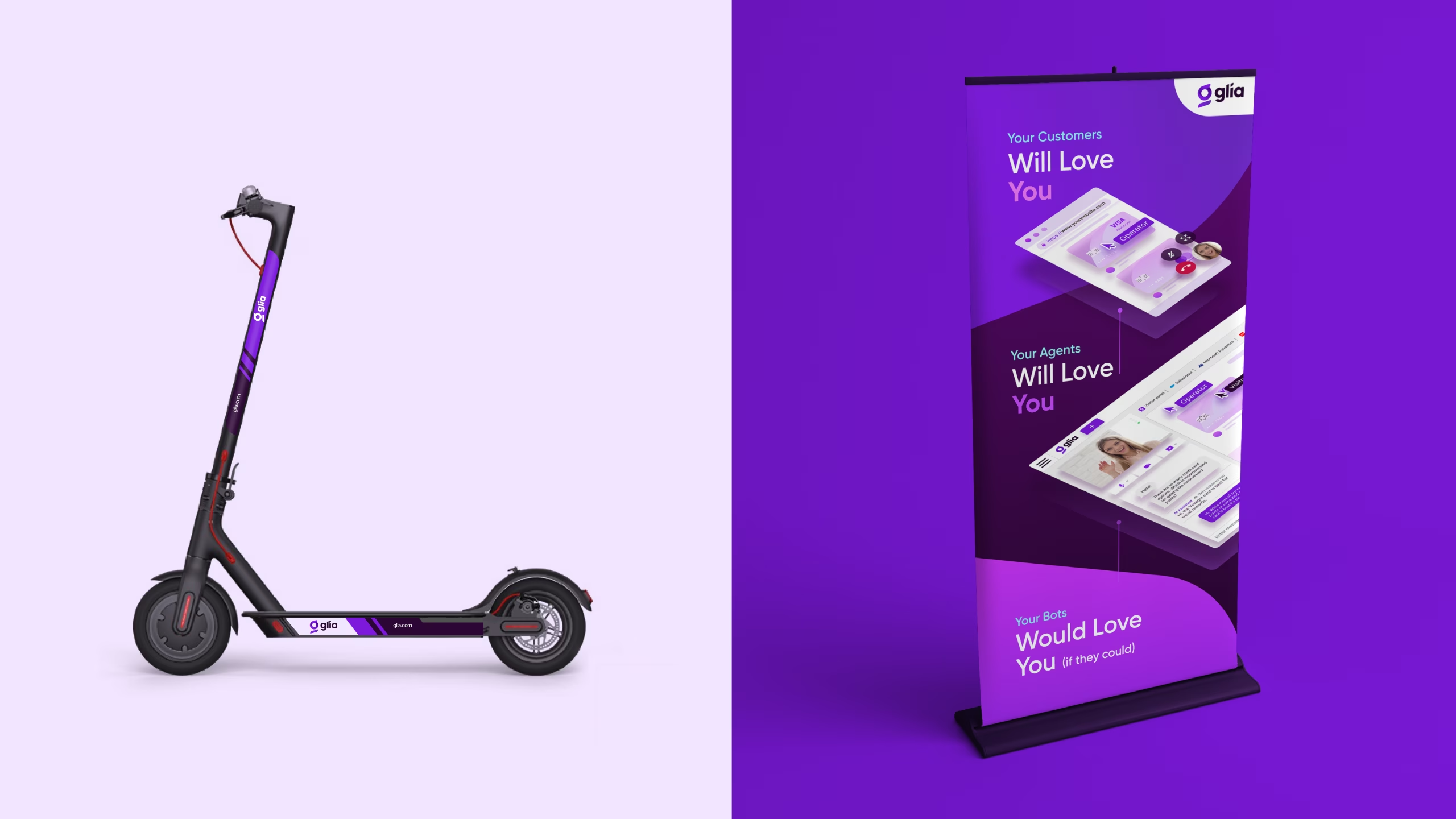
Glia wanted something premium and realized that back in 2018, no one was using purple. At the time, all competing brands were either blue or orange. Purple, however, has long been associated with royalty, power, and wealth. Its elite status dates back centuries, stemming from the rarity and high cost of the dye originally used to create it. In fact, purple fabric was once so expensive that only rulers could afford it.

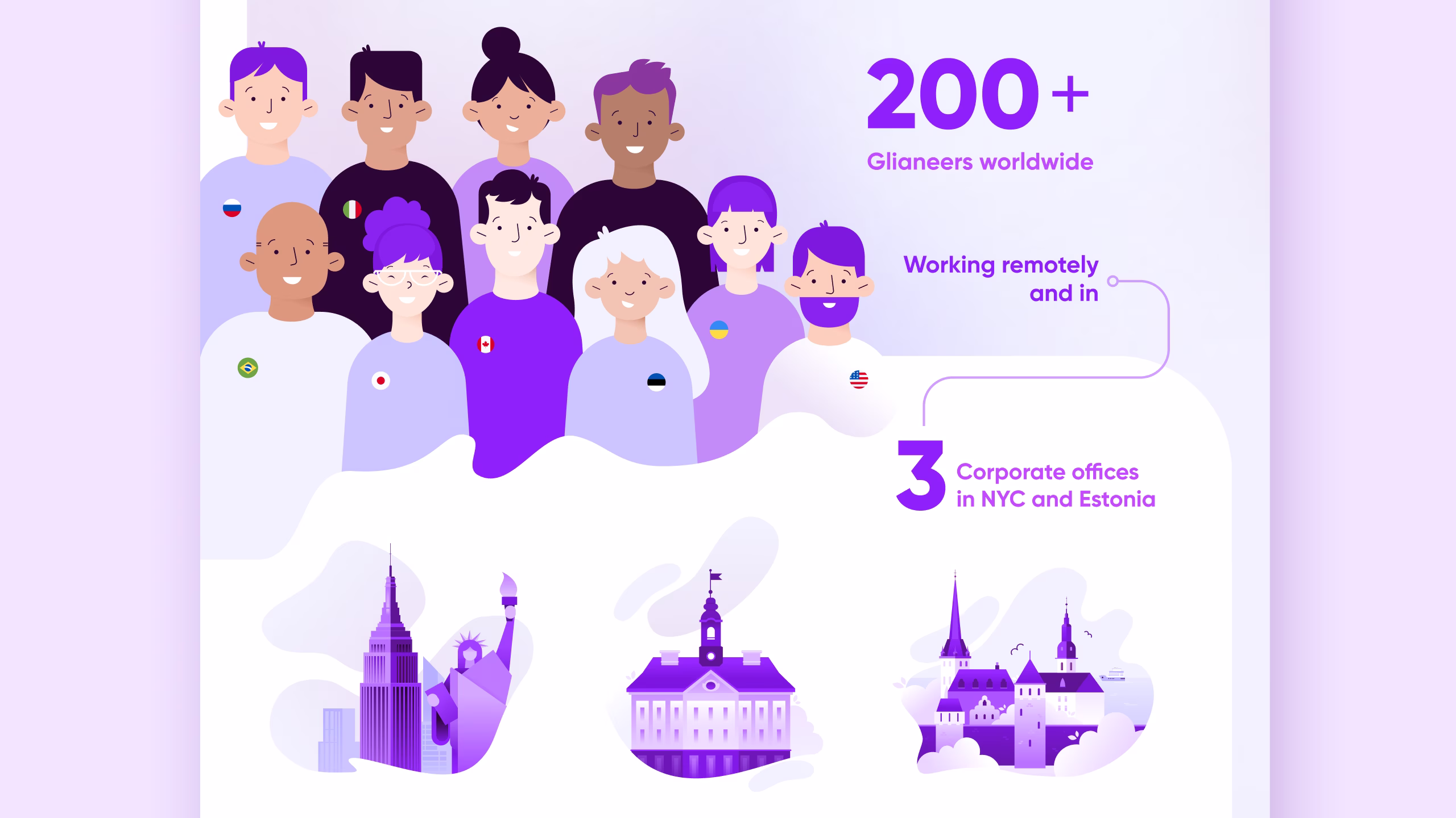
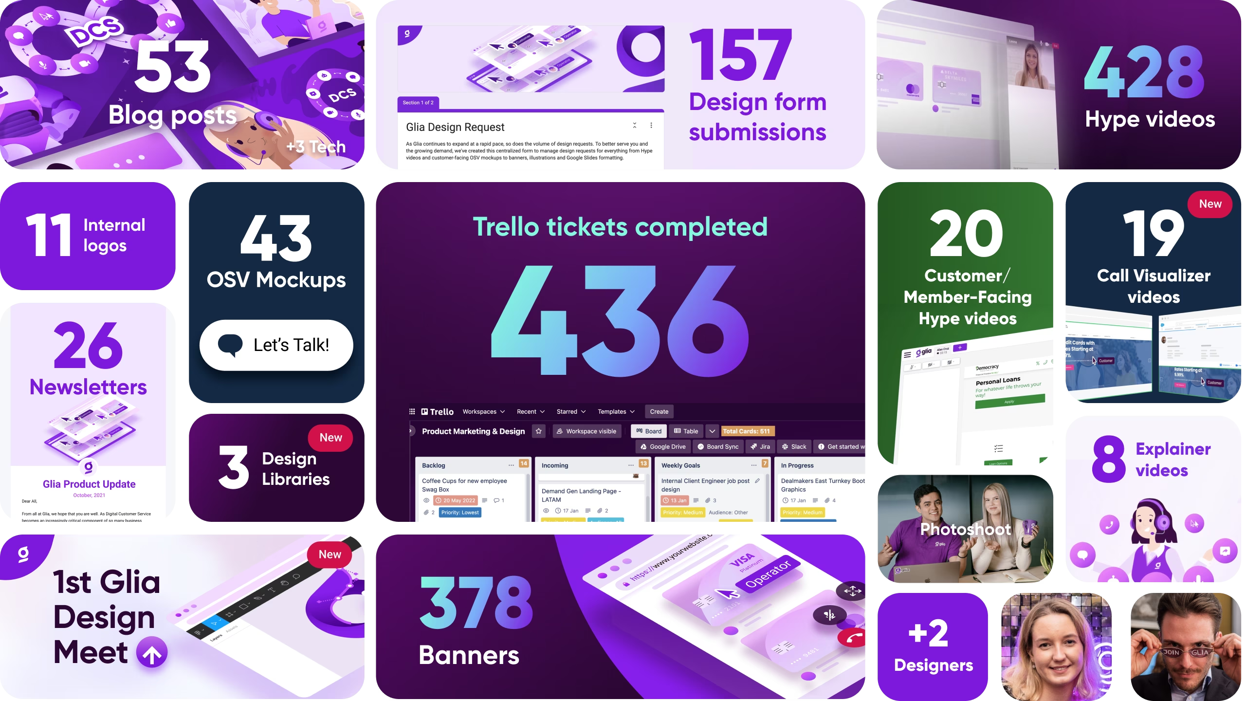
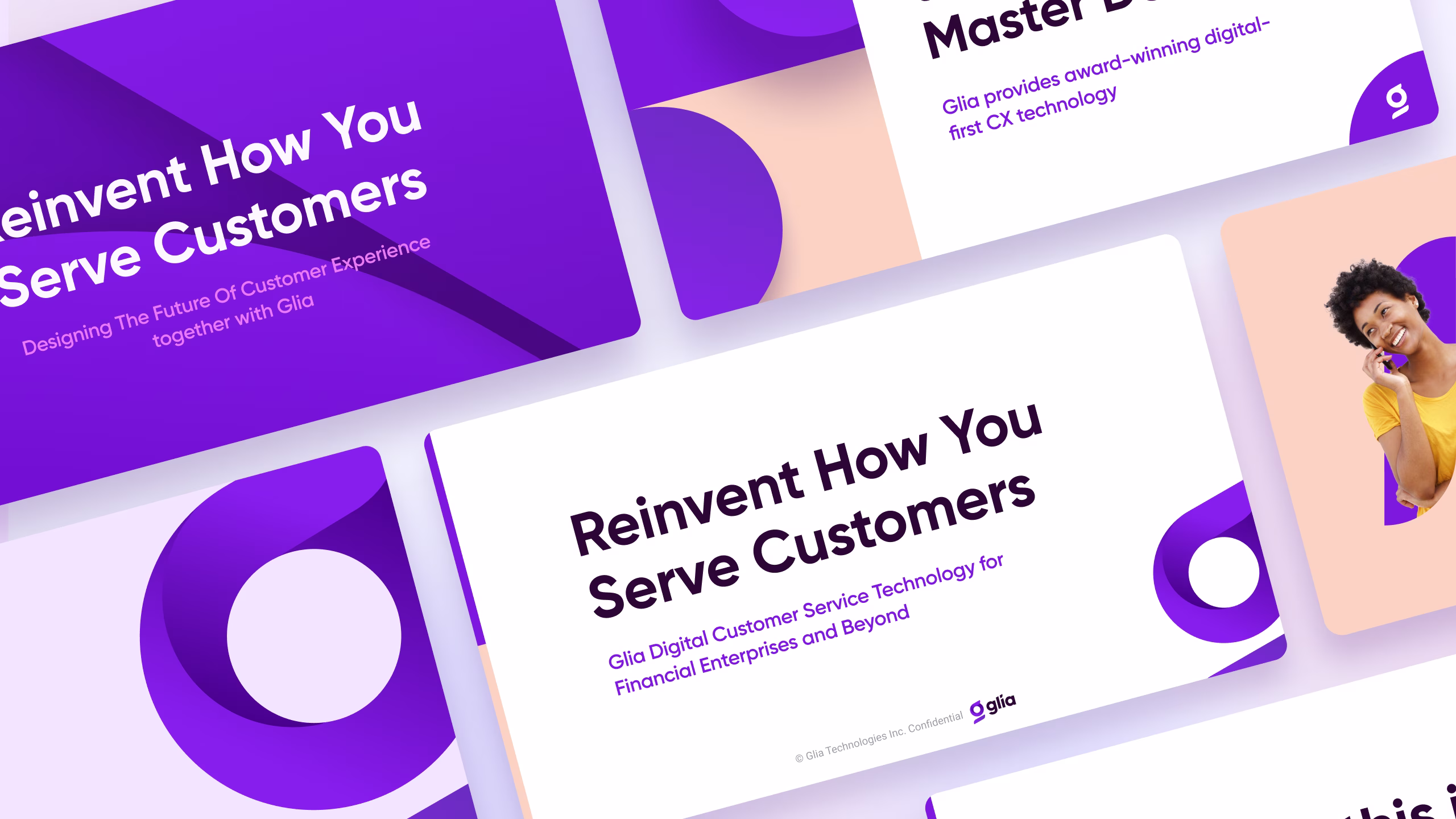
Since the rebranding, Glia has experienced a tenfold increase in customers and reached a valuation exceeding $1 billion. As of 2025, Glia has partnered with over 600 insurance companies, banks, credit unions, and other financial institutions worldwide to improve the customer experience and drive business results.
Since the brand's launch in 2019, many direct competitors have adopted design elements, marketing strategy, and brand tone from Glia.