
Brand
A fragmented identity without a clear narrative or strong foundation for trust. Communication leaned on rates and performance, leaving a gap in why investors should trust Lendermarket, not just what they could earn.
Explore brand


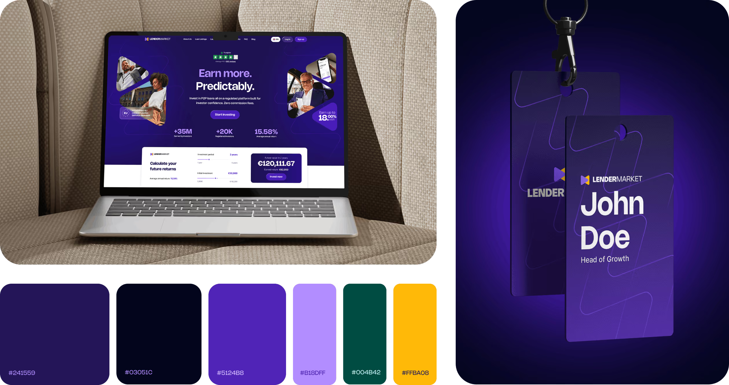

Lendermarket is a European P2P investment platform connecting individual and institutional investors with lending companies. Established in 2018, it has grown into an established player in the European P2P investment market with over 30,000 registered investors.
Upon joining as Visiting Head of Design, it quickly became clear the challenge went beyond an outdated visual identity. As the business matured, its brand and marketing experience fell behind, while key parts of the investor experience lacked clear structure, hierarchy and guidance, creating a growing gap between the company Lendermarket had become and the experience it presented to investors.
My role grew into bringing those experiences back together, from brand and website to the core investment product.
Trustpilot rating over the course of the engagement.*
Increase in new-user deposits during the 12 weeks following launch.
Invested in Lendermarket's Auto Invest FLEX product within its first 3 months.
*Trustpilot movement reflects the combined effect of the design engagement and broader customer-relations initiatives.
"Rasmus worked across three fronts at once: product, brand and our new website. You can see and feel it in just how coherent everything is.
What stood out most to me as CTO is that he's remarkably easy to work with. No ego, no endless alignment meetings. One call to discuss an idea, and within a couple of days you can already see the first iteration. If you're looking for someone who can take design ownership at a company level, Rasmus is the person I'd turn to first."

A fragmented identity without a clear narrative or strong foundation for trust. Communication leaned on rates and performance, leaving a gap in why investors should trust Lendermarket, not just what they could earn.
Explore brandDifficult to operate as a modern marketing platform. Publishing depended on engineering, design and implementation lacked a shared system, and organic visibility was weak.
Explore webKey investor journeys lacked structure, hierarchy and guidance. The opportunity was a more coherent experience that could build trust and scale with the business.
Explore productAs Visiting Head of Design, I led a company-wide change process that went far beyond design deliverables. With no Head of Marketing in place at the time, I conducted interviews with the leadership team and investors, aligned stakeholders around a shared direction, and helped drive the brand and website transformation from strategy through launch.
A significant part of the role was change management: bringing different perspectives together, creating clarity around what needed to change and why, and turning that direction into work the organisation could actually adopt and carry forward.
As AI makes assets cheaper, value moves upstream: to framing the problem, setting direction, and defining what good looks like.
I audited the existing brand and communication, then interviewed stakeholders and investors to understand where the experience was creating confusion or weakening trust. Investor research reframed the opportunity around what mattered most.
The deeper issue wasn’t visual. Communication had become campaign-led and over-reliant on performance numbers, explaining what investors could earn, but not what Lendermarket stood for. The result was a brand that could signal performance without building trust, personality or long-term purpose.
The research revealed distinct priorities across three investor groups. Growth-oriented investors valued performance and autonomy. Cautious investors looked for transparency and regulatory reassurance, while emerging investors needed the category to feel accessible and credible. Across all three groups, predictable returns remained the strongest commercial driver. These insights helped to shape the proposition, messaging hierarchy and tone of voice.

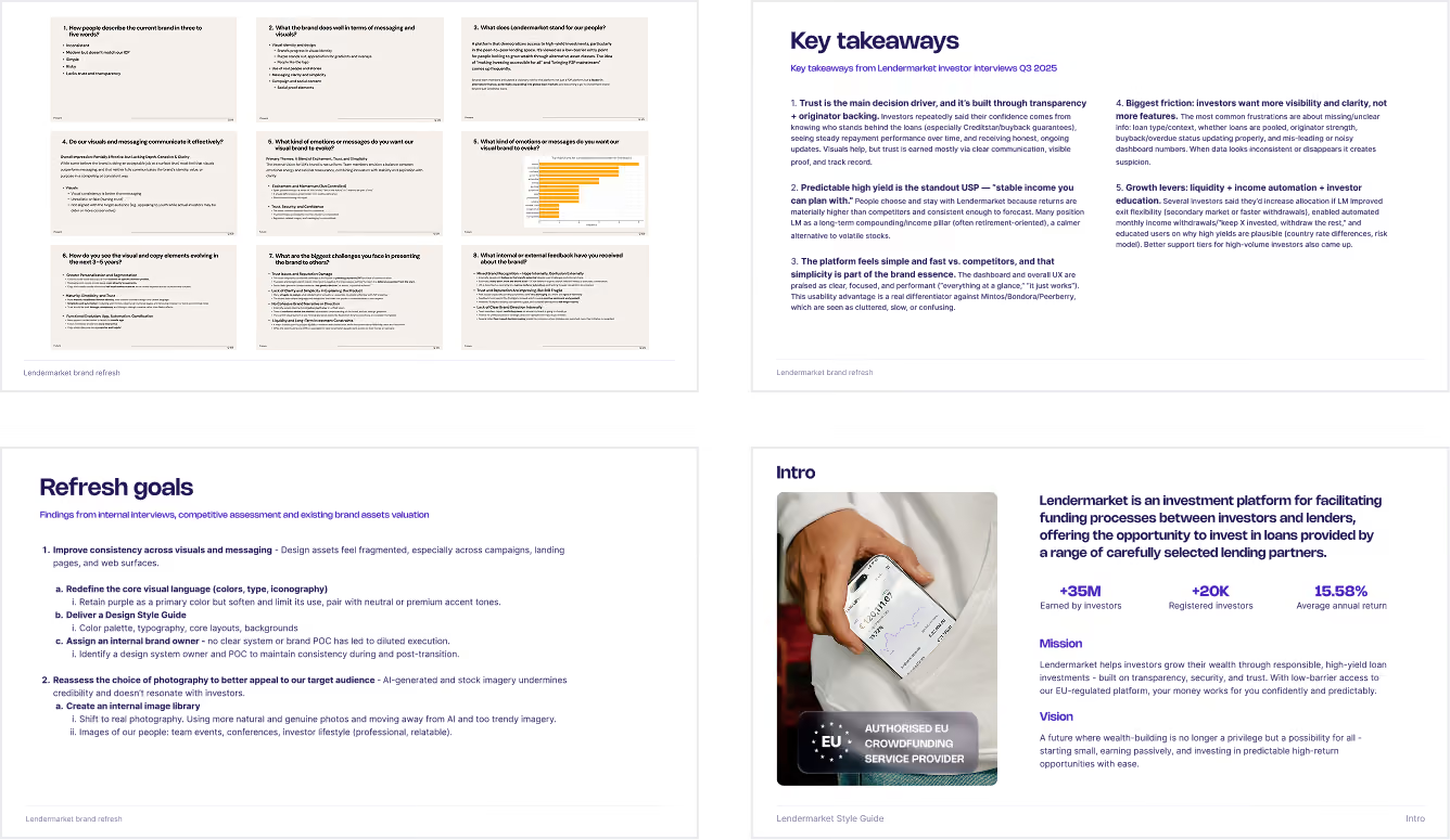
These findings led to the proposition “Earn more. Predictably.” “Earn more” captured the tangible financial value, while “Predictably” expressed the category’s core appeal: knowing the expected interest rate upfront and being able to plan around a clearer return expectation.

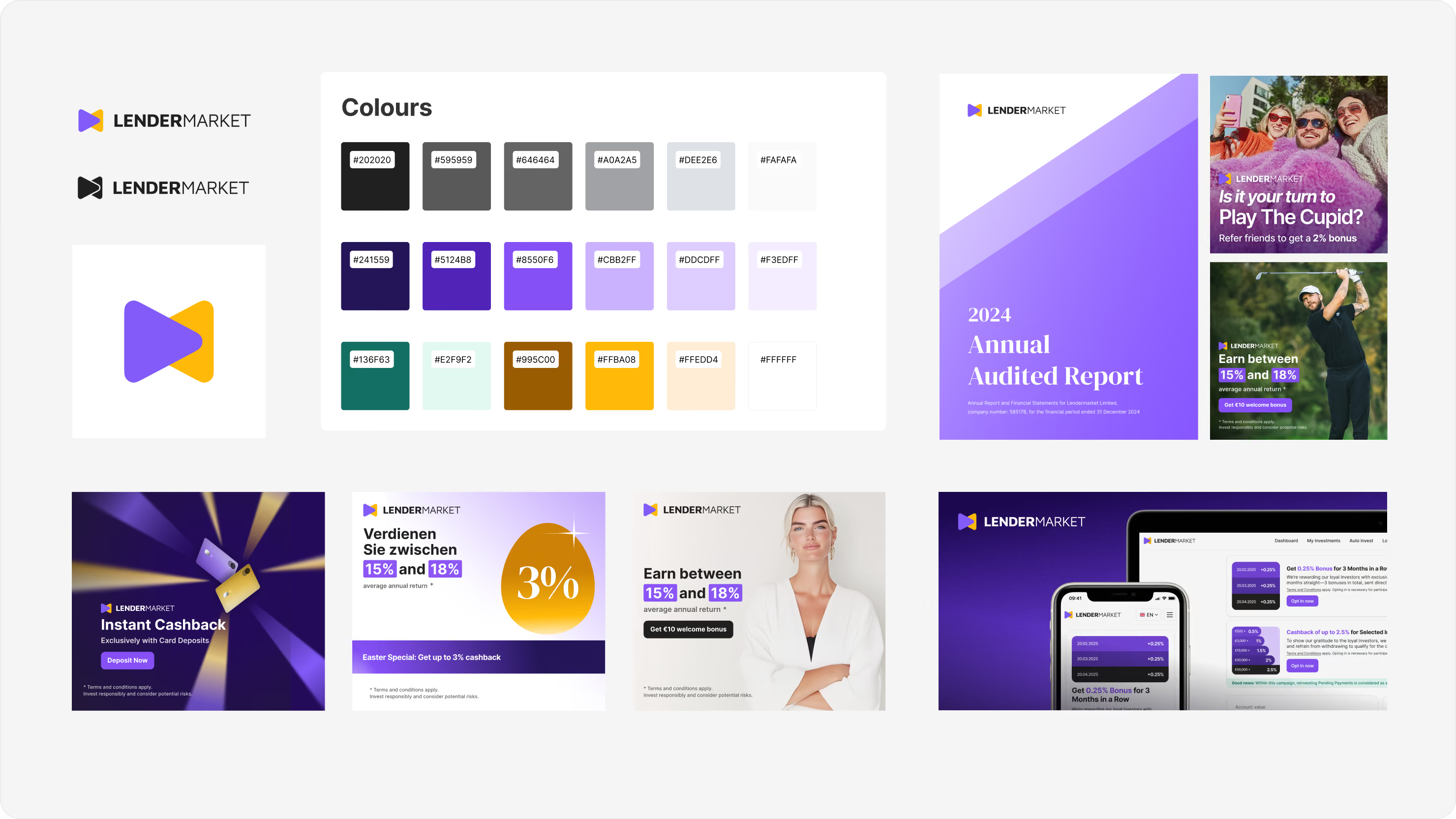
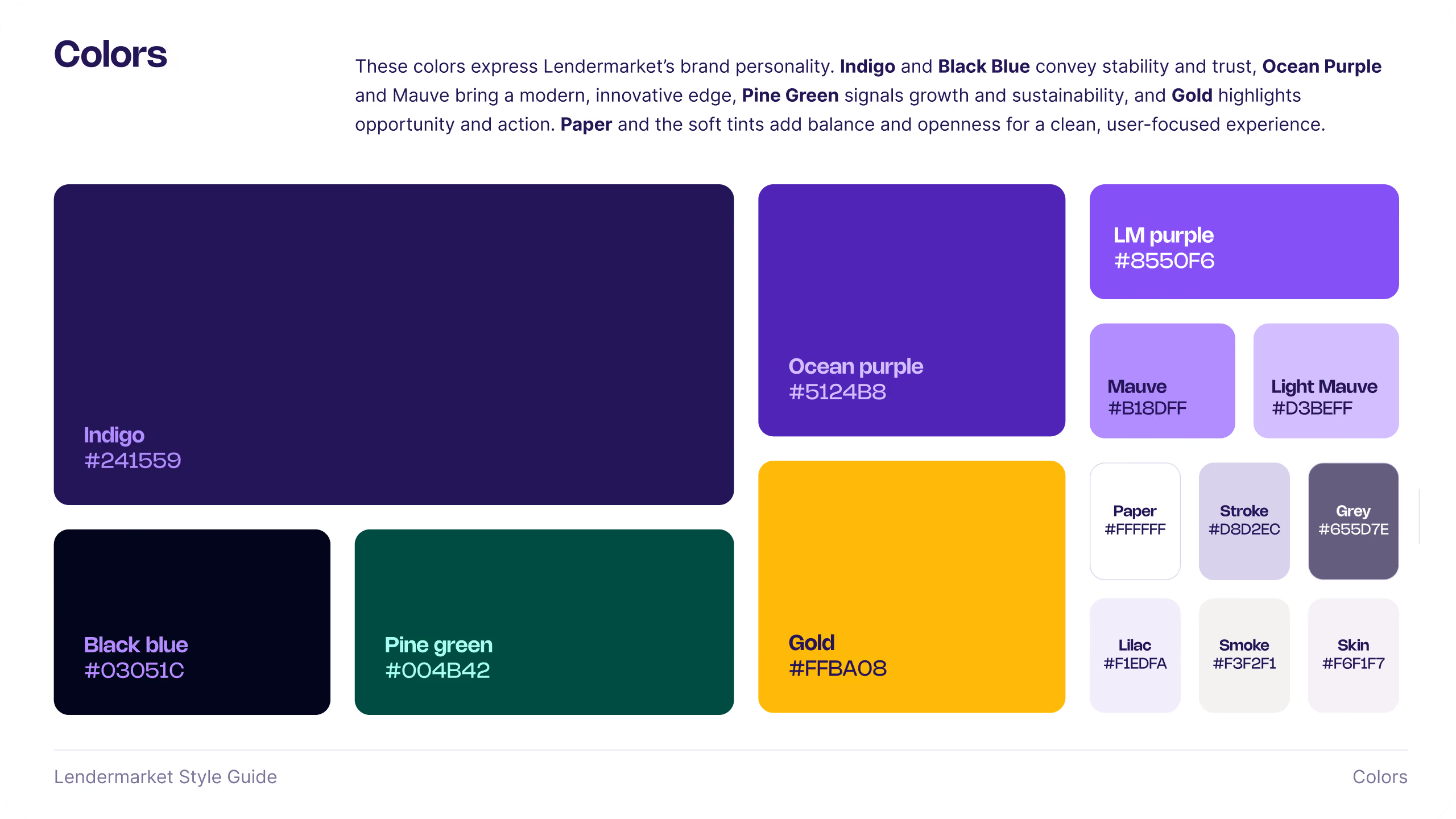
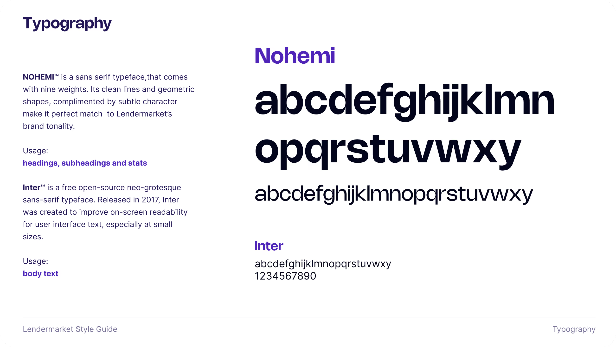
From a visual perspective, this was a focused brand refresh rather than a complete rebrand. Maturing Lendermarket’s existing identity, retaining recognisable elements, and building a more credible visual language around the new proposition. Typography, colour, photography and reusable components were refined as one connected system.






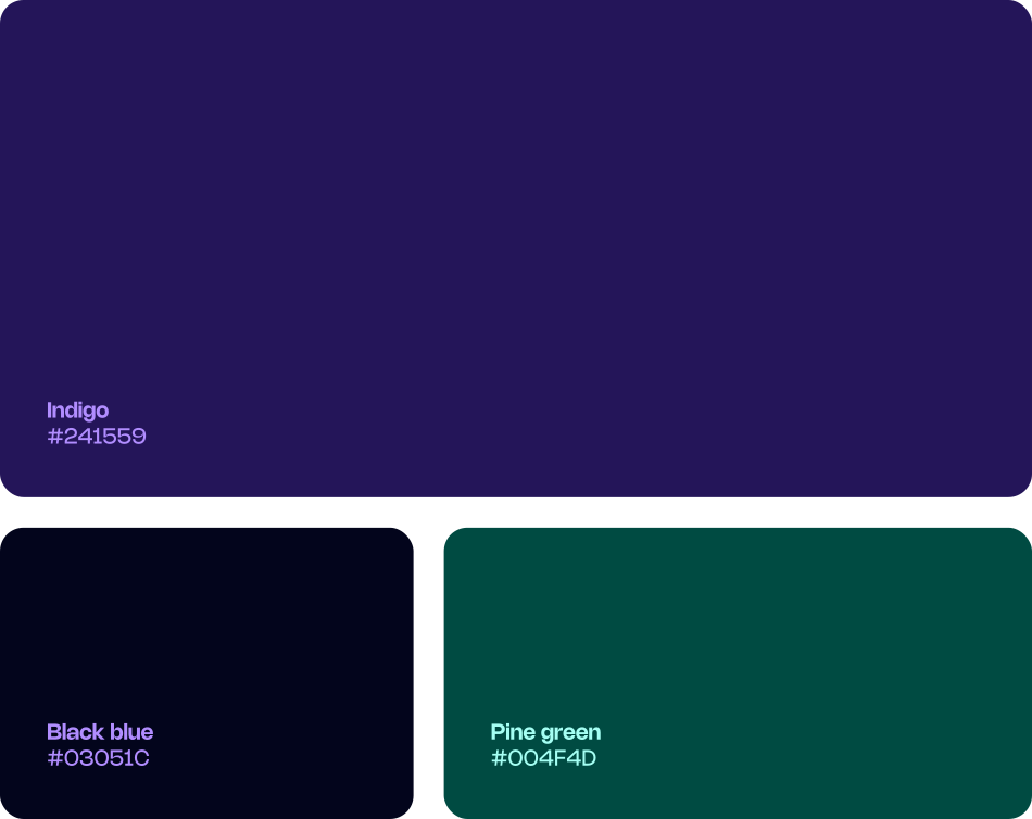
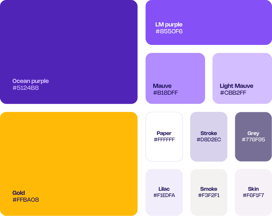


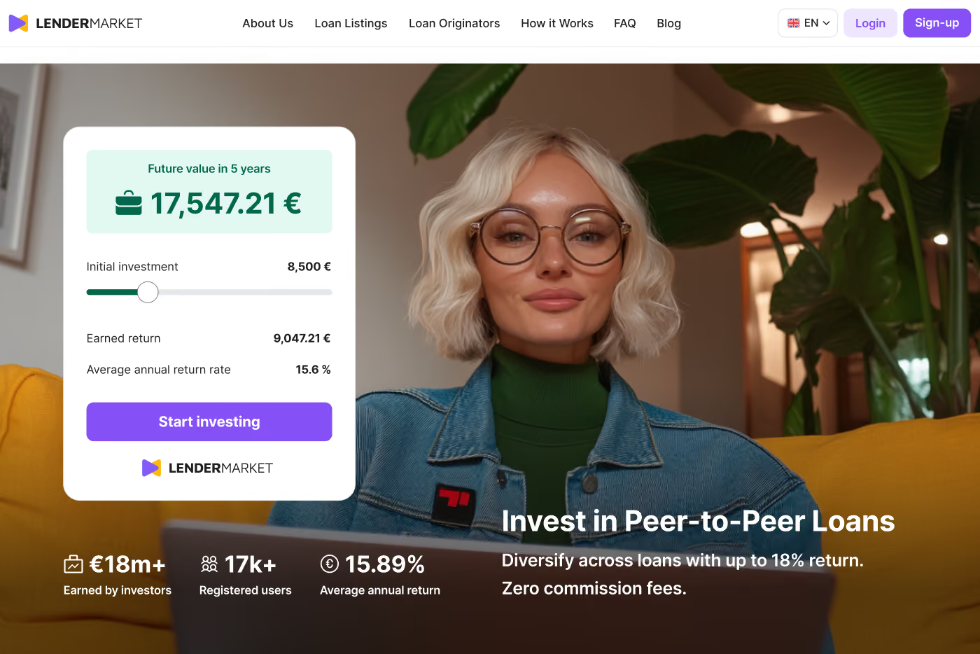
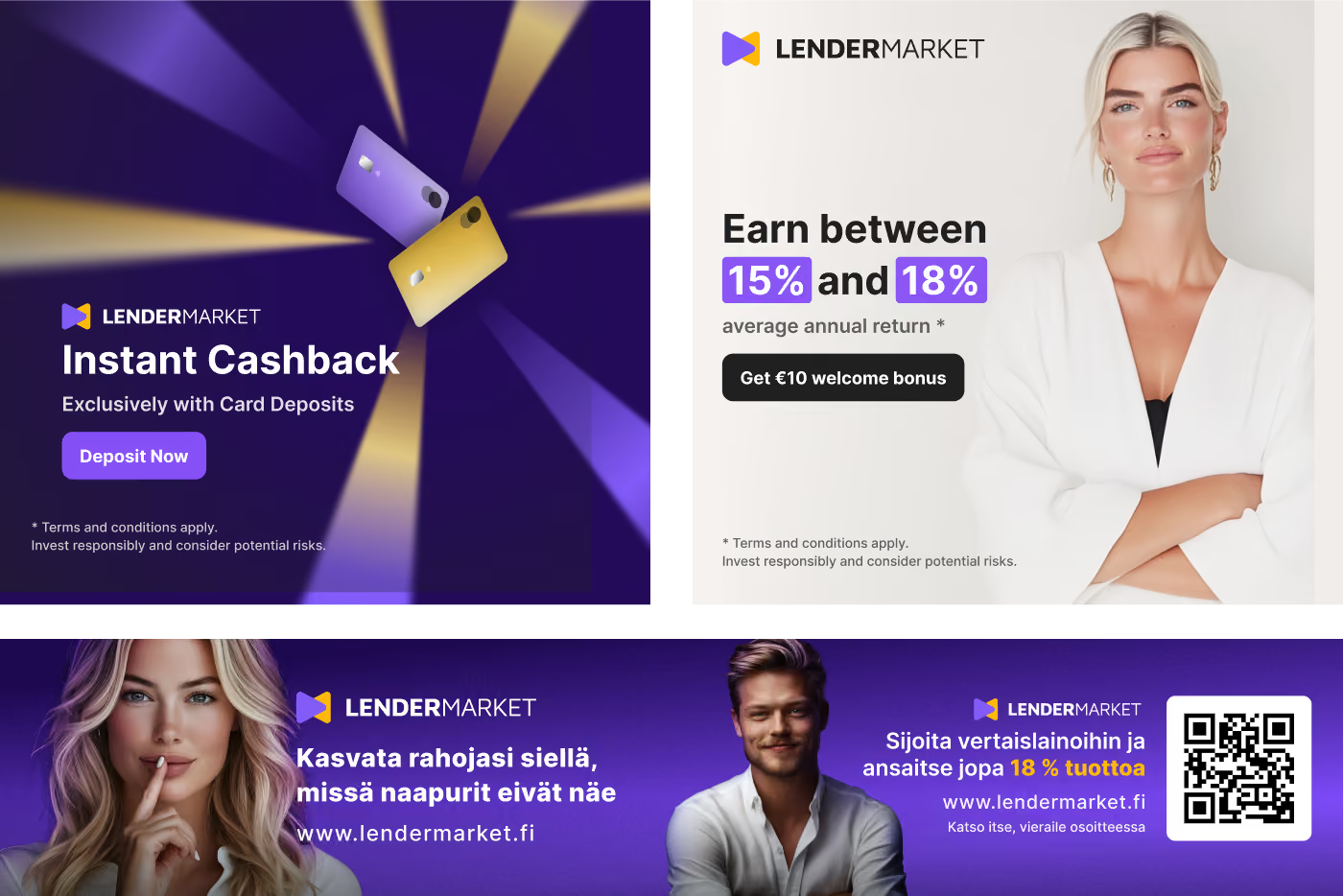
Imagery should reflect the calm, confident rhythm of predictability, giving users peace of mind. People appear relaxed, natural, and at ease. No exaggerated expressions or fake smiles, just authentic moments of trust, clarity, and control. Diversity in both race and age.



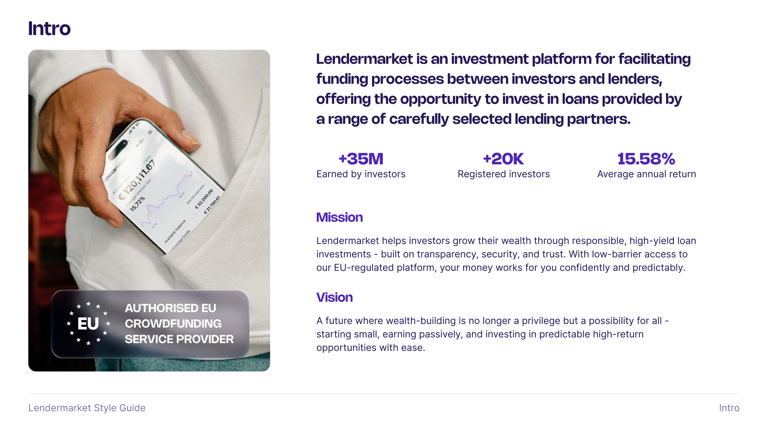

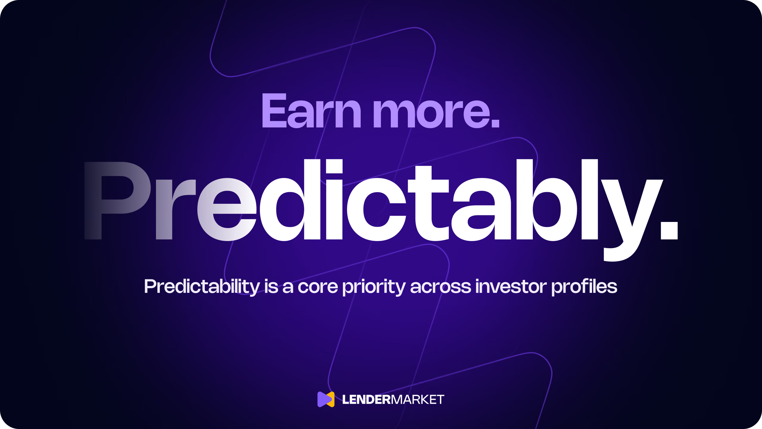
The refreshed identity was built to perform across real-world applications, not just sit within a style guide. I translated the system into campaigns, digital touchpoints and reusable communication templates, giving the team a consistent foundation for creating new work while allowing each application to respond to its context.


Trust couldn’t remain an abstract value. It needed to become visible throughout the experience. I translated this into trust-centric assets and content patterns: clearer regulation signals, stronger use of Trustpilot reviews, and testimonials built around real names, faces and experiences. High returns create attention, but also scepticism. Communication had to balance ambition with evidence.


Trust isn’t a value statement. It’s something investors can see and feel.
Audit & interviews
Positioning & proposition
Visual direction & messaging
Guidelines & assets
Implementation & support
Publishing content, updating pages and launching campaigns frequently required engineering support, while the lack of a shared system between Figma and the live website led to inconsistencies and duplicated work. Running seven localized versions added significant operational complexity, allowing visual and technical defects to accumulate across locales and weakening the credibility an investment platform needs to communicate.
Beyond the operational problems, the website's expression hadn't kept pace either. Messaging and visuals felt dated next to competitors, and trust signals were thin: investor testimonials were scarce, Trustpilot reviews weren't given real visibility, and there was little transparency around regulation or track record. Every investor, first-time or experienced, moved through the same undifferentiated journey, regardless of what they actually needed to feel confident acting.
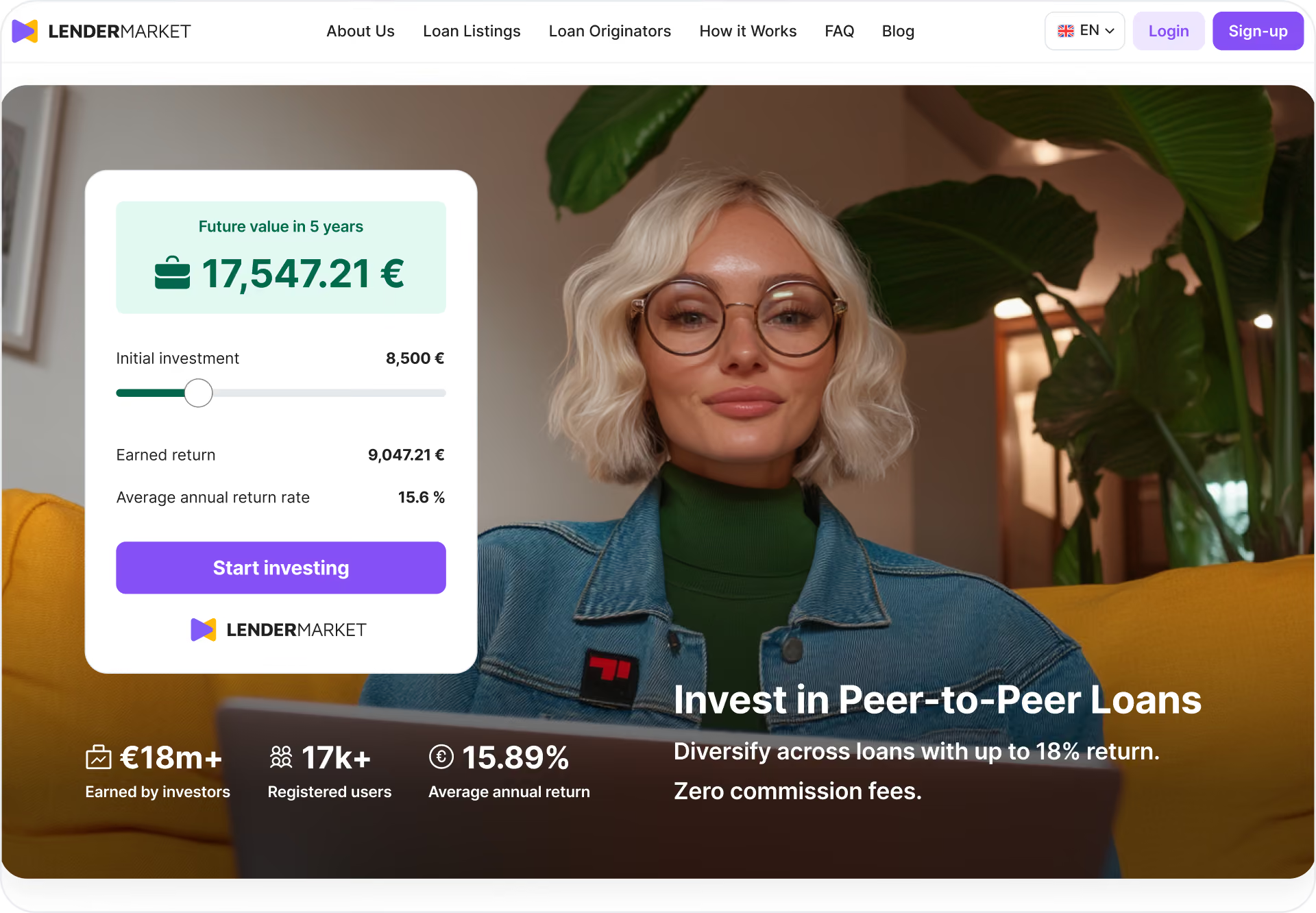
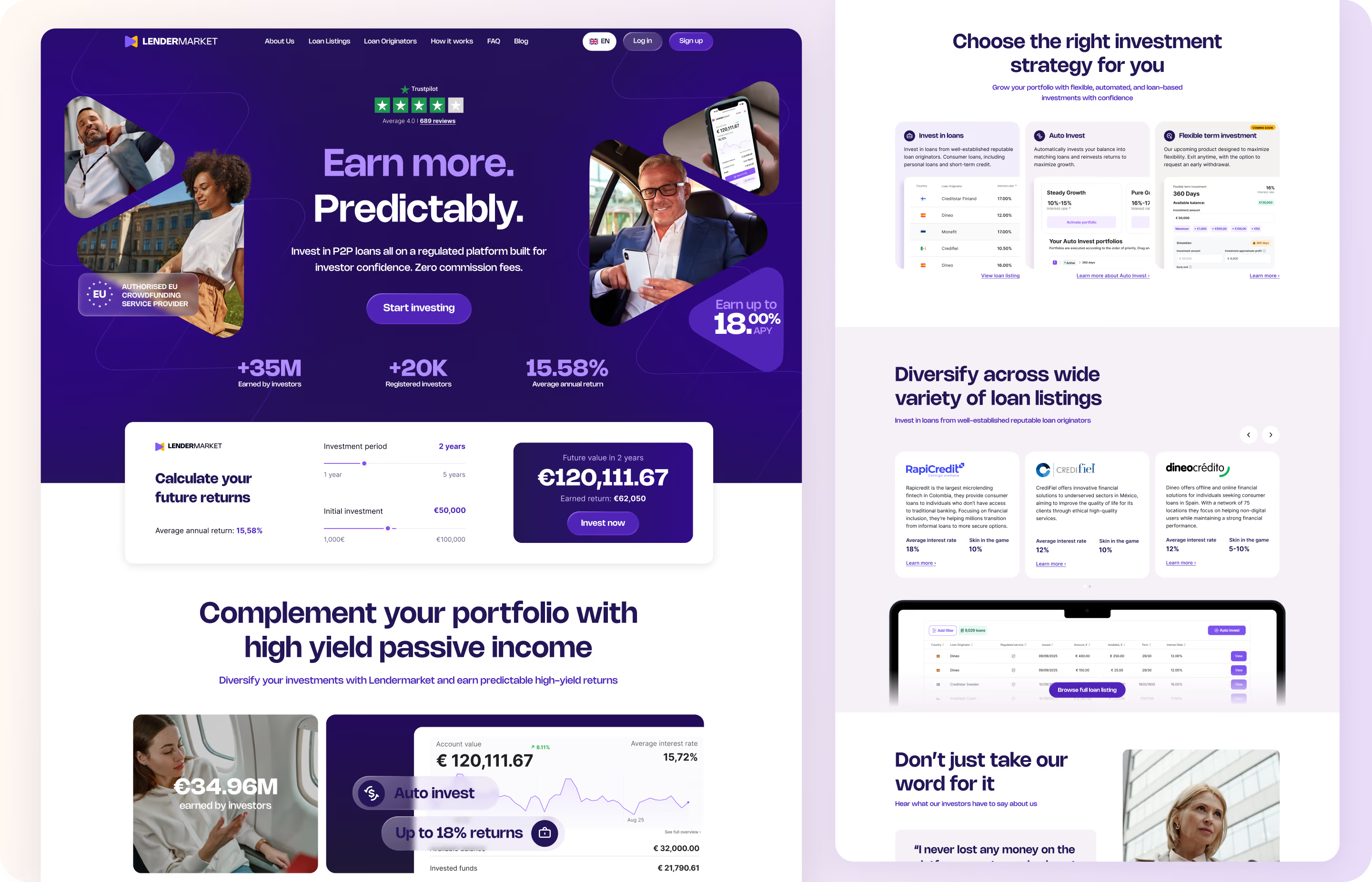
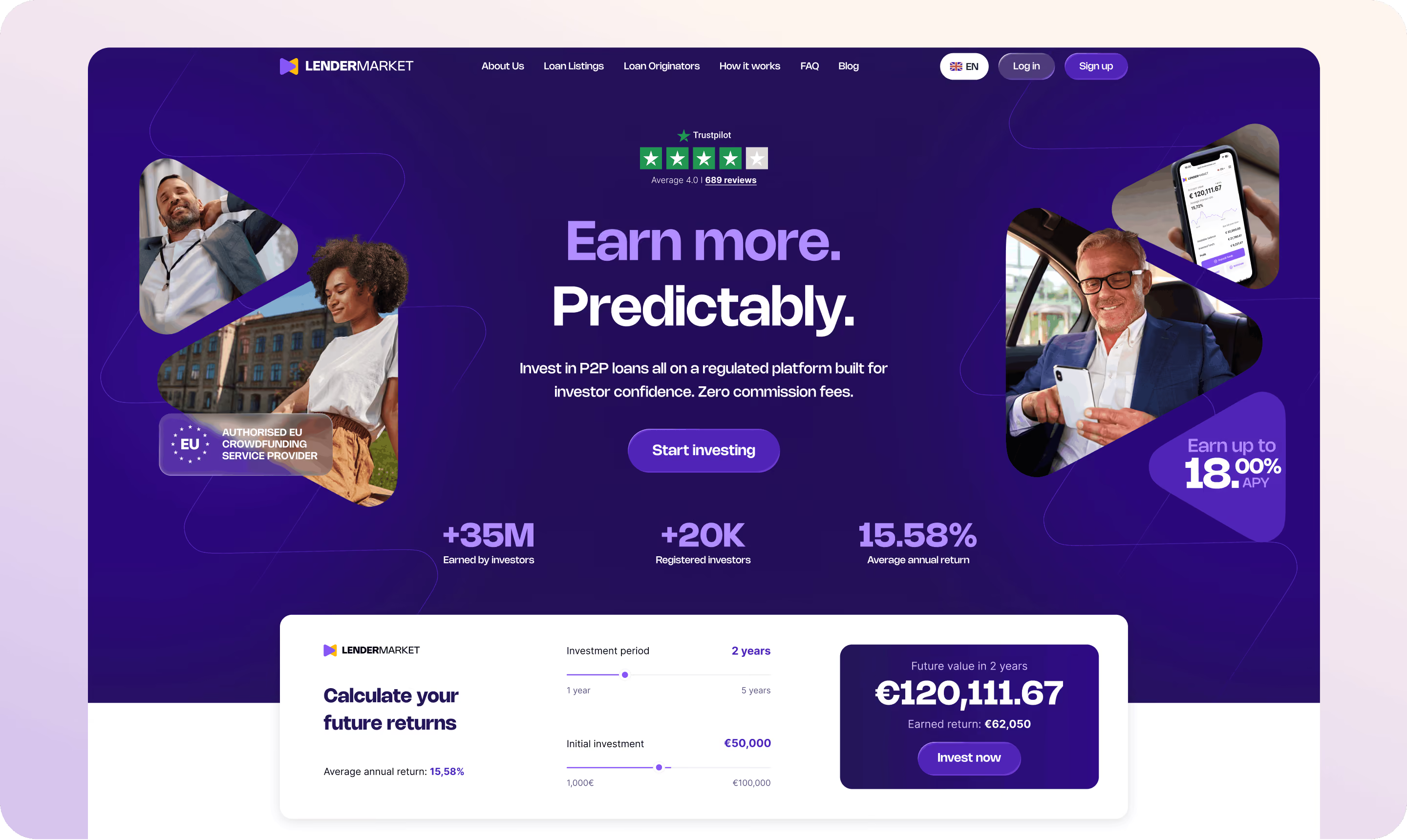
The goal wasn't simply to redesign the interface. It was to give marketing ownership of the website and create a platform that could support faster publishing, campaign experimentation and long-term growth. I restructured the experience around a Webflow CMS, reusable page templates and modular components that reduced the need for engineering involvement in everyday marketing work.


A shared design system turned design decisions into a publishing system marketing could run.


The website was also where the brand's trust-and-proof framework had to live day to day. I rebuilt key pages to bring investor testimonials, Trustpilot reviews, and regulation and track-record information into view earlier in the journey, rather than leaving them buried below the fold or absent entirely.
Positioning shifted too, from competing on rate alone to communicating what actually set Lendermarket apart: credibility, transparency, and a track record investors could verify for themselves.

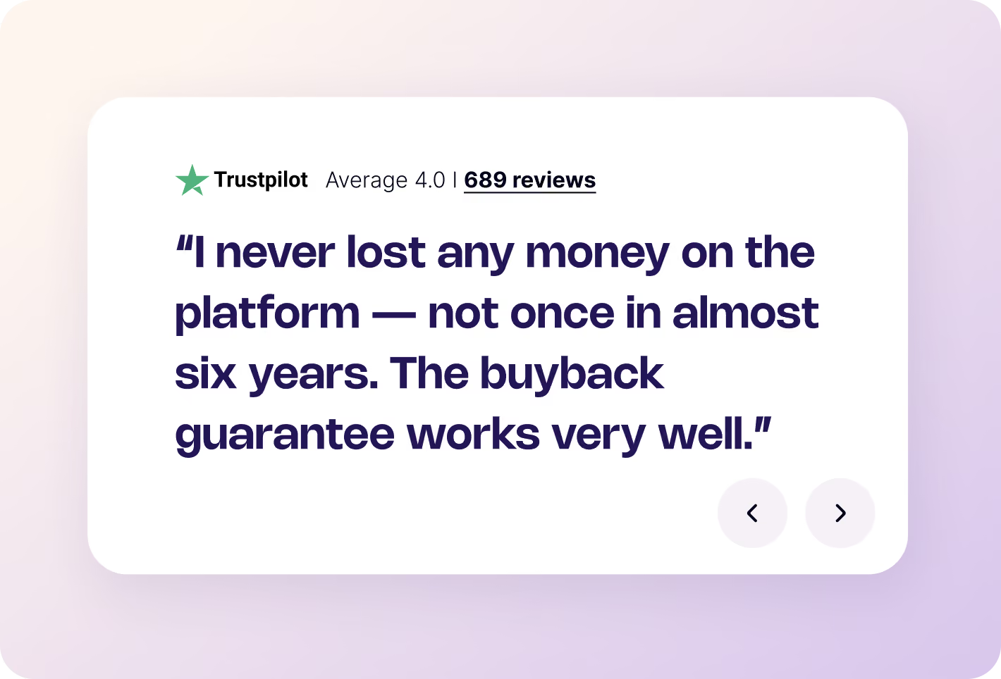

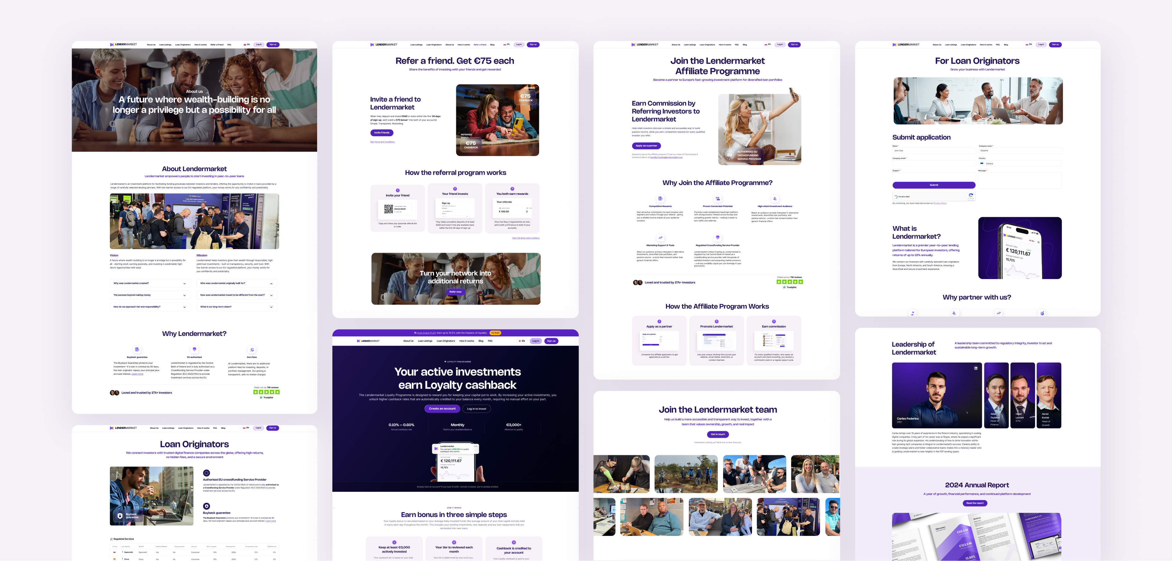
Localisation was not simply a translation layer: it required structuring and coordinating seven site versions across EN, DE, ES, FR, IT, FI and PL, maintaining visual and technical consistency, and optimising SEO for each locale. SEO, AEO and analytics foundations made the platform easier to discover, measure and improve over time.

A website investors trust, and marketing can actually run.

Audit, analytics, personas
IA, journeys, CMS strategy
UX/UI & messaging
Figma/Webflow, localisation
Field testing & feedback
Organic traffic
New depositing investors
Deposits from new users
Lighthouse SEO score
Product design had largely evolved feature by feature, without a structured way of identifying problems or guiding decisions. The result was an experience built for confident, experienced investors who were already comfortable with P2P lending. In practice, investors arrived at very different starting points: a first-timer needing basic guidance, an existing investor managing a growing portfolio, or someone who'd barely used the platform since signing up.
The opportunity was to bring more structure to that process by combining investor interviews across these personas with behavioural data and business context, guiding decisions rather than treating each feature as an isolated task.
The dashboard redesign began with observed investor behaviour rather than interface preferences. I analysed 30 days of heatmap and attention data to understand what users looked for, where they took action, and which parts of the existing experience they routinely overlooked.

Heatmap data. The evidence revealed a clear hierarchy. Investors focused on account value, returns and available funds, while Deposit, Withdraw and Invest attracted the strongest action-oriented engagement.

UX findings. At the same time, important information was repeated across multiple cards, the Invest action sat below the average fold, and large promotional areas received comparatively little attention.
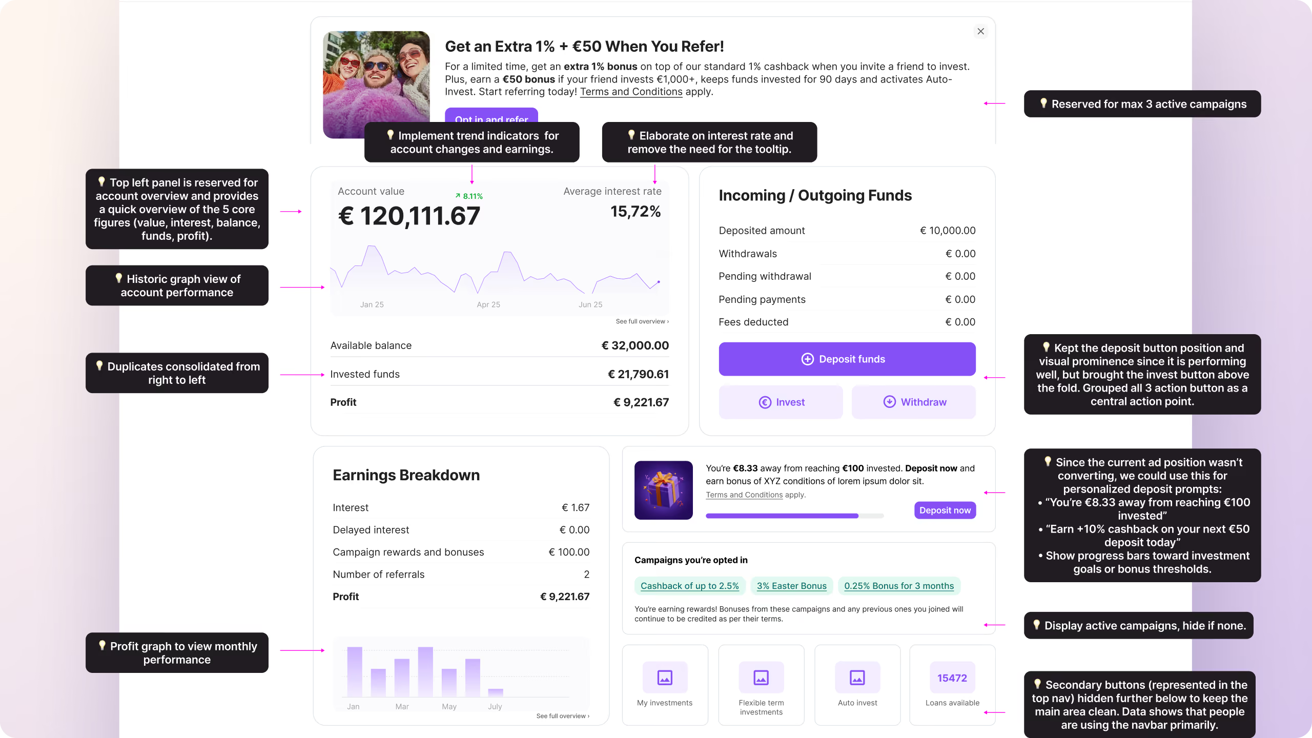
The redesigned direction consolidated the essential account information, brought primary actions together above the fold and introduced performance trends to make changes easier to understand.
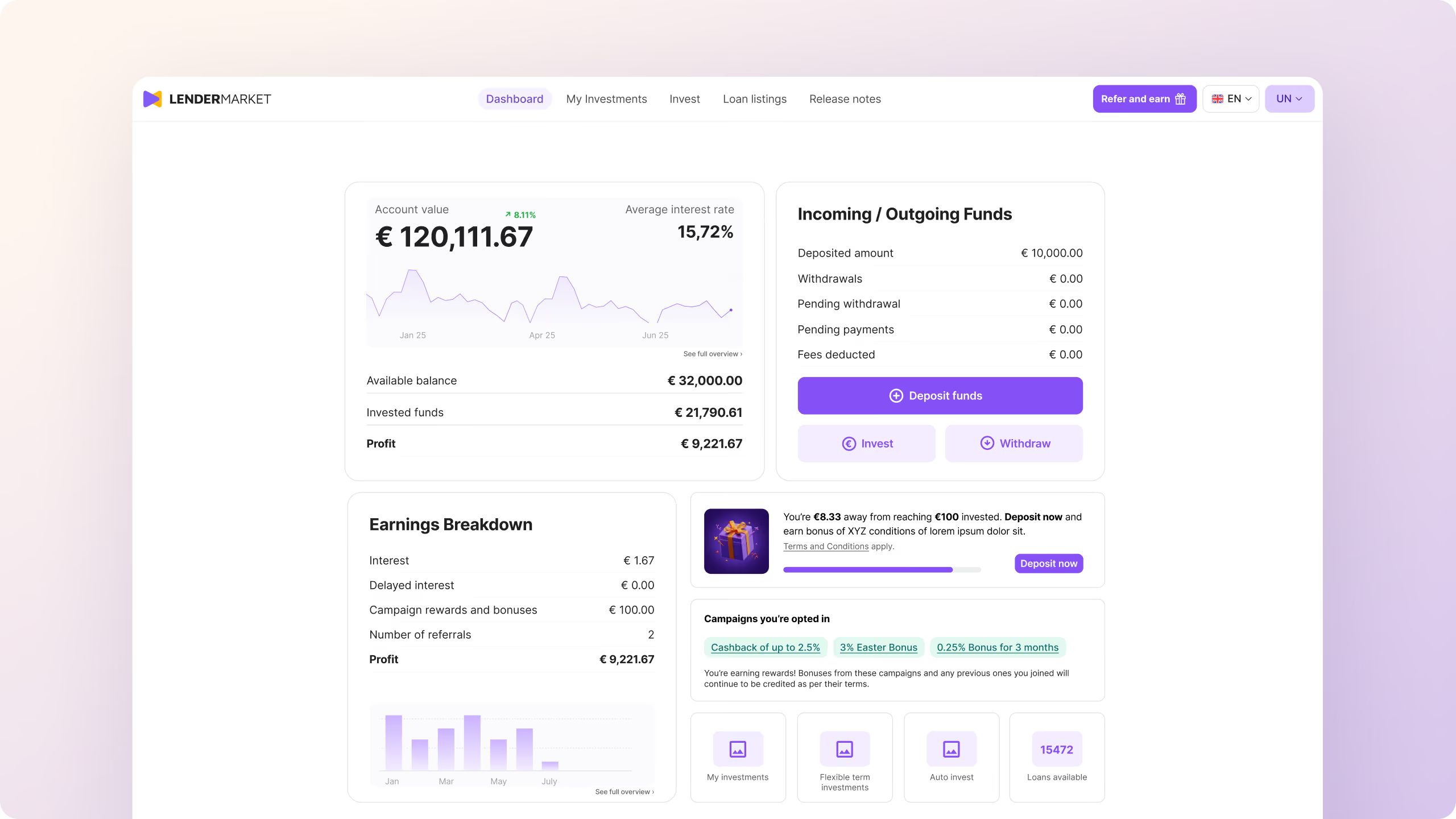
The result was a dashboard concept shaped around the decisions investors were already trying to make, rather than assumptions about what they might need.
Q3 2026 investor survey: Navigation scored 4.05/5 across the markets, confirming that the platform’s overall structure was working and that investors found it easy to use.
“Rasmus leads design with a real sense of ownership. He combines strong product knowledge with sharp critical thinking. He doesn't design for aesthetics alone, but always with real user and business problems in mind. He has genuinely helped us shape a strategic part of how we build our product.”

Auto Invest FLEX began as a business opportunity: a more flexible investment product that would let investors exit at any point. The design challenge was to turn that proposition into an experience people could understand and trust without adding more complexity to the platform.
I shaped how FLEX was positioned, discovered and created, connecting the commercial idea to a clear investor journey. The experience made the value of flexibility legible while communicating how exiting worked at the moments investors needed that reassurance.

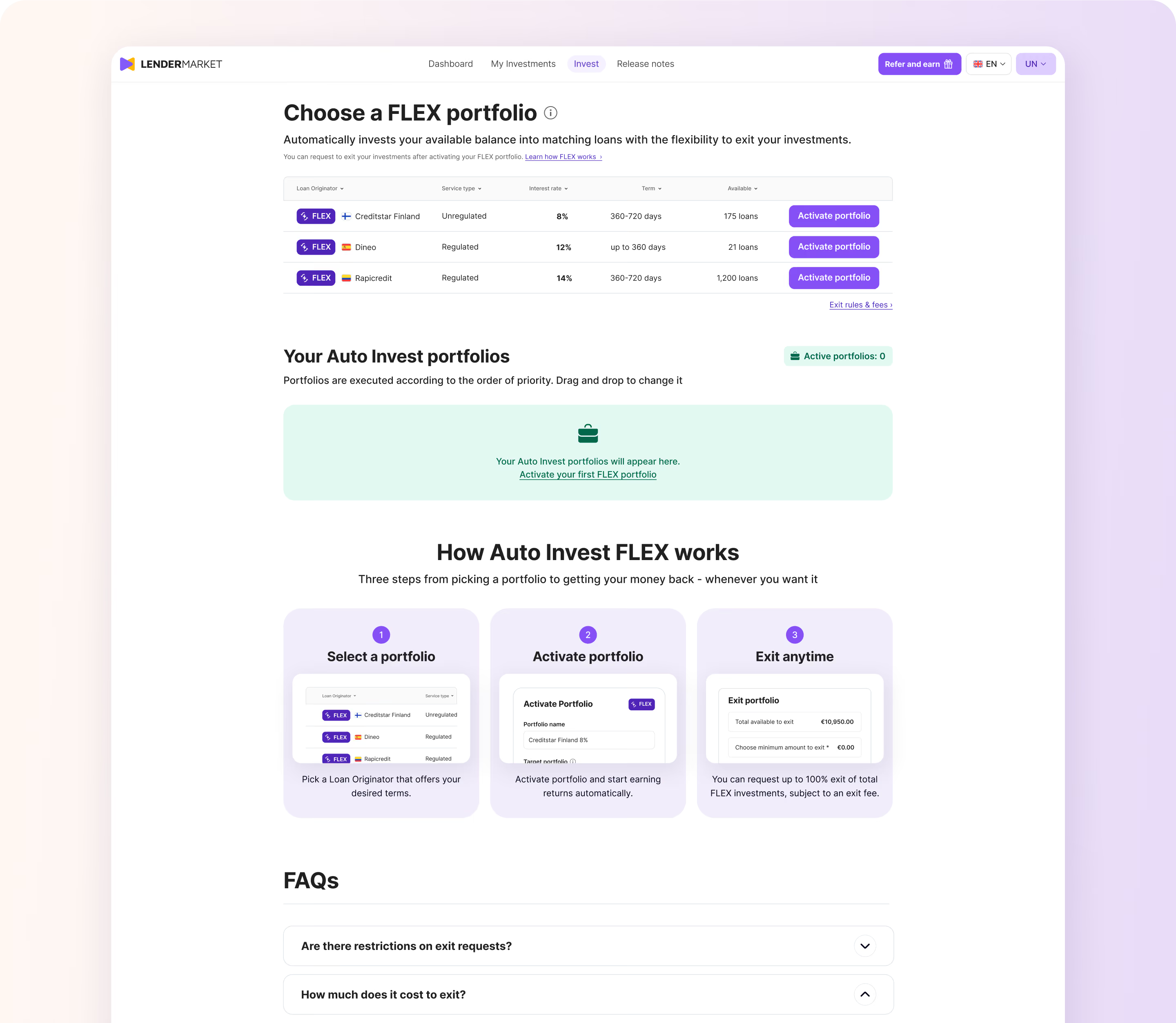
Invested in Auto Invest FLEX within its first 3 months of launch.
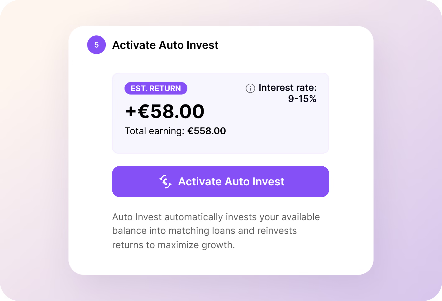
First-time investors often did not know where to begin. A guided flow replaced the open-ended “figure it out” experience with a small number of clear steps, helping investors get set up and make their first investment in under a minute.
A five-step journey turned an unfamiliar investment decision into a clear sequence of manageable choices. Investors could understand the amount, period and service type before activating their first investment.
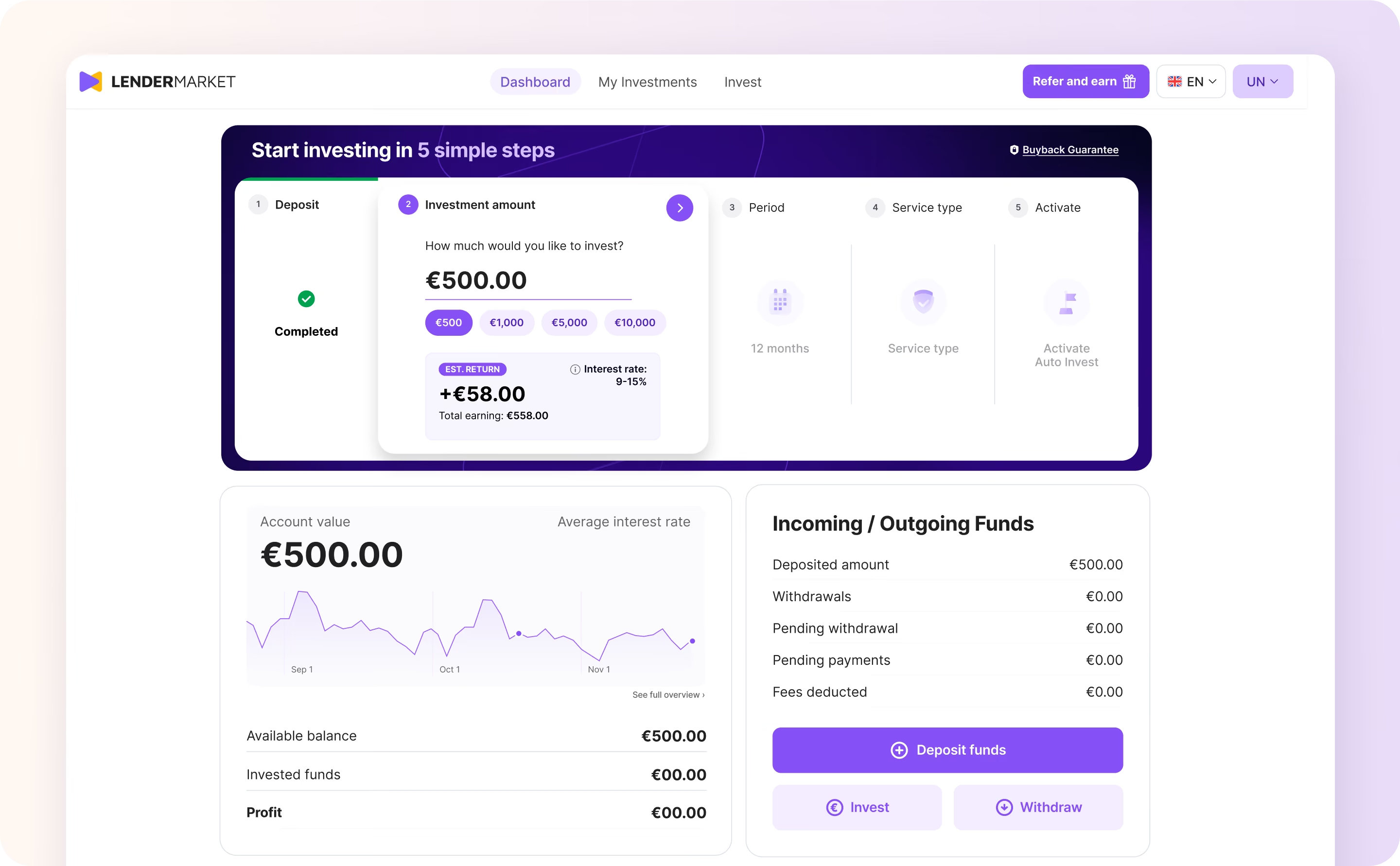

Invested in Auto Invest FLEX within its first three months of launch.
Product decisions grounded in investor behaviour, research and business context.
A repeatable product-design approach the team could apply beyond individual features.
The lasting impact wasn't any single launch. It was a shared foundation connecting brand, marketing and product, giving the team clearer principles, reusable tools and the ability to move forward with greater consistency and confidence.
Trustpilot rating over the course of the engagement.*
Increase in new-user deposits during the 12 weeks following launch.
Invested in Lendermarket's Auto Invest FLEX product within its first 3 months.
*Trustpilot movement reflects the combined effect of the design engagement and broader customer-relations initiatives.
Considering embedded design leadership for your next stage of growth?
Let’s talk!
Rebranding from SaleMove to Glia.
Read case study
Premier Glia community event, bringing together 450+ industry leaders.
Read case study